Soyuz TMA-15
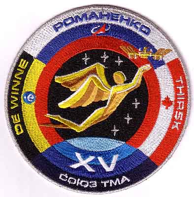
The official patch for Soyuz TMA-15, launched on May 27, 2009
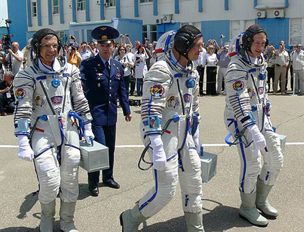
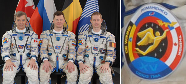
The crew on launch day: Canadian Space Agency astronaut Bob Thirsk, Roscosmos cosmonaut Roman Romanenko and ESA astronaut Frank De Winne.
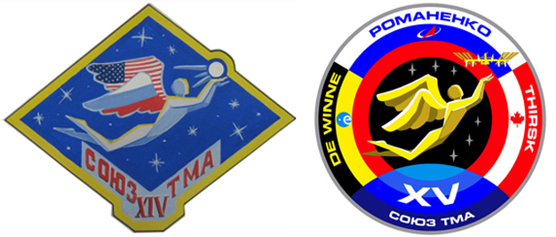
Left: The original idea by Yura Menkevich. Right: the final artwork was created by Erik van der Hoorn of Spaceview/Spacepatches.nl, with input from Roscosmos, Luc van den Abeelen, Jacques van Oene and graphical assistance from Jorge Cartes. Copyright: Roscosmos/Spacepatches.nl.
An angel, painted by 15-year old Yura Menkevich of the Kemerovskaya region in West Siberia, Russia, was chosen by Russian spacecraft commander Roman Romanenko as the central element for his Soyuz TMA-15 patch. Similar to the Soyuz capsule he shares with Frank De Winne of Belgium and Robert Thirsk of Canada, the angel is graciously sailing towards the International Space Station. The ISS orbit is symbolized by a red circle, composed of the outer bands of the flags of the crew's home countries. The orbit extends into one of the blue bands of the Earth, emphasizing the strong connection between the space program and our home planet. The two groups of three stars symbolize a safe launch and a safe landing.
Together, the six stars also commemorate that beginning with this flight, a permanent six man crew will be present aboard the ISS.
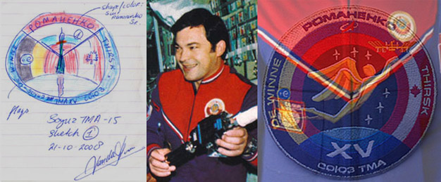
Erik's first sketch for a TMA-15 patch dates back to October 2008, shortly before the Russians
announced their children's contest. The drawing was partly based on an idea he and Jacques had talked about. The division of the circle was inspired by the typical red-and-blue, Salyut-era commander's suit, as
worn by Roman Romanenko's father, cosmonaut Yuri Romanenko. Some months later,
the idea turned out to be a perfect background for Yura's angel.
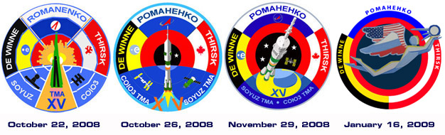
Originally, a Sun was drawn inside the red circle.
Behind the rocket, it looked too much like an explosion, so it was left out.
The blackness of space that remained, gradually grew in size.
The final design before Yura's angel arrived, had a 6-shaped flight path for the first 6-man ISS crew. At right is the very first time the two designs met.
Erik: ,,We got word in January, 2009, that Roman Romanenko liked Yura's
design for TMA-14. It had already caught my eye, because of the wonderful solution Yura had found to incorporate the flags. Unfortunately, his idea was not very well suited for a mission with three
nations involved. The tight shape around the angel did not leave much room for alternatives either. So I decided to combine it with my own design, before trying
anything else. I changed the colors of the angel to yellow, because we already had enough blue in the Earth.
Commander Romanenko immediately liked the result. Less than a month later, a printed version was on the suits of the cosmonauts in their official photoshoot."
The artwork was first seen in public on March 10, when NASA posted images from a February 12 Star City photoshoot.
It showed an early version of the artwork - with a different ISS and light blue letters for the Soyuz TMA XV designation,
which might have worked for embroidery, but did not turn out well in print. It was changed to white at the request of Roscosmos head Anatoly Perminov.
The finalized logo - formally approved by Perminov on February 25 - was released on April 3, 2009.
The paper flag Frank De Winne was wearing on his suit during the official photoshoot.
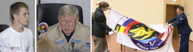
Left: Yura Menkevich. Center: Anatoly Perminov with the patch. Right: Roman Romanenko wrestling with a 2x2 meter (36 million pixel) version of the artwork.
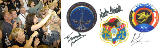
A small flag Frank's wife Lena (in black dress, Romanenko's father Yuri - in white shirt - is seated one row behind her) had made to say goodbye to the crew.
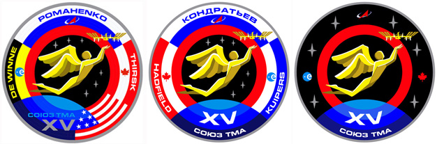
Three alternative versions.
Left: one of the proposed designs reflecting Roman Romanenko's original request, including an American flag for returning crewmember Nicole Stott.
On March 3, 2009, it was officially announced she would land on the Shuttle. Center: a design for the backup crew with names - not produced.
The Canadian flag was moved to the left, to prevent the colors in the Dutch flag to be confused with the French flag.
Right: a 'neutral' version with only the red orbit, was selected as the official back up crew patch. Erik: ,,My 3-year old son Hugo wanted to do some 'patch designing' on the computer like daddy. I opened the picture of the prime patch for him and I removed a couple of layers, so he had some space to draw something himself. Seeing the red ring only, without the other colors of the flags, I knew instantly this would be the back up patch. Hugo keeps saying this is 'his' patch, that will only fly when 'one of the cosmonauts gets sick'."
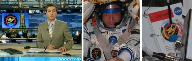
Left: Russian television used the back up patch as the general mission logo in their broadcast.
Center: Back up commander Kondratiev wearing the patch. Right: an earlier American version made it into space on the cover of a NASA flight document.
|
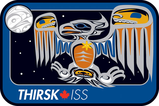
Bob Thirsk Personal Patch
|
Left: the final artwork of the patch, as revealed on February 17, 2009, right: the embroidered patch.
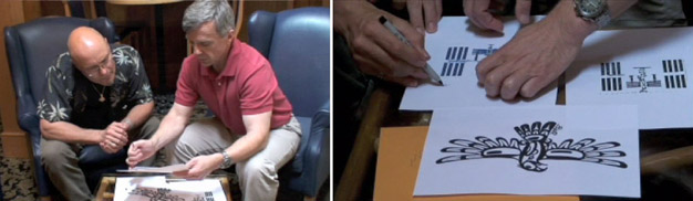
Designer Bill Helin and Robert Thirsk working on the patch in May 2008.
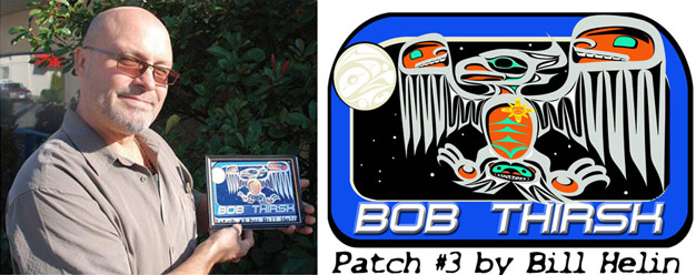
Designer Bill Helin with an earlier version of his patch.
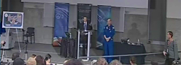
An overview of the stage at the University of Calgary where Thirsk revealed his patch.
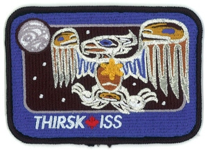
This patch commemorates Canada's first long duration Expedition onboard the International Space Station (ISS). Canadian Space Agency astronaut Dr. Robert Thirsk will live and work in the Station for six months. Robert is an admirer of Pacific Northwest Indigenous art, and is honoured that Bill Helin, a renowned Tsimshian artist has accepted to portray his mission through the use of several of its mythical figures.
The International Space Station has now become the largest and most powerful spacecraft in history. As viewed from above, the ISS resembles a great soaring bird. The legendary Thunderbird is a creature of great power and strength and is featured as the central element of this patch design. It resembles the near-complete Station during the mid-2009 timeframe.
Several of the structural components of the International Space Station are abstractly depicted by anatomical elements of the Thunderbird. The Space Station's eight solar arrays are depicted by the outermost large feathers of the Thunderbird's great outstretched wings. The inner triplets of smaller feathers represent the thermal radiators that provide cooling to the Station's onboard systems and astronaut inhabitants. The head and beak represent the modules of the Japanese and European partners. Canada's contributions to the international partnership, the ISS robotic manipulators, are represented by the curled appendages on the back of the head. The blue ovoid of the Thunderbird's eye indicates the location of the Node 2 docking port, where the new Japanese cargo vehicle, HTV, will be berthed with the aid of Canadarm2.
Human faces adorn each wing. These faces are identical in form and kinship. One face symbolizes the astronaut crew in orbit, while the other symbolizes the large support team on Earth. The two faces gaze with trust and respect at one another in their common pursuit of the Expedition objectives. This unique partnership between the crew and the ground support team is the basis of the first Canadian Expedition.
A bear head is stylistically depicted within the tail of the Thunderbird and signifies the Russian portion of the Station. The tail feathers identify the four Russian modules including the MRM2 module that will be added to the Station in late 2009. The Thunderbird's two claws are outstretched and symbolize they are ready to grasp the American, Russian and Japanese spacecraft that will dock with the Station during the Increment 20/21 timeframe.
The torso of the Thunderbird represents the American Laboratory as well as the laboratories of the partner nations. The ribs represent the research racks and experiment facilities - the settings for innovative research in science, engineering and medicine. The knowledge gained from the onboard research activities during Increments 20 and 21 will benefit people on Earth.
A radiating Sun occupies the position of the heart within the Thunderbird's torso. As the most important aboriginal symbol of life, the Sun represents the enhanced life support system, which now provides the Station with the capability to support a crew of six astronauts.
The silver outline of the Thunderbird recalls the glistening exterior of the Station when sunlight sparkles off of its aluminum structure. The golden yellow and brown of the wings are similar in the coloration to the Station's solar arrays.
The head of a Raven is depicted within the Moon. In its partially-open beak is a sun disk. It was the cunning Raven, according to Northwest Coast native legend, who stole the sun from a box in a powerful chief's house many years ago and flung it into the sky to bring light to the world for the first time.
While the Thunderbird is revered as the chief of Earth's skies, he has the heart of an explorer. His gaze is directed toward the Moon. He yearns to explore new destinations in space and to undertake new adventures. Similarly the first Canadian Expedition aboard the International Space Station rekindles a national spirit of exploration. Our enhanced abilities to live and work in space will enable Canada to participate with other nations in the exploration of future destinations in space.
This patch was designed by Tsimshian artist, Bill Helin, a friend and supporter of the Canadian space program.
Contact us at order@spacepatches.nl if you are interested in an original Soyuz TMA-14 patch. A very limited number is still available.
TMA-14 | ISS Index | TMA-16
www.spacepatches.nl